Guiuiui

Hey people,

today I’m going to talk about an alternative UI design I made for our game, for an assignment.

I’ll show you my process in making a interactive menu interface with a coherent artsyle. First of I wanted it to be very organic and directly implement it in the tree of the menu. I’m going to show it to you so you have a clearer idea of what I mean.

Here it is:

backroundgui

I liked how it looked on the tree but immediately noticed that it’s kinda difficult to see the letters properly. If I had more time to perfect it, I would have tried harder with this one. The problem however is that I badly understood the assignment, thinking it was something else. Which left little time for me to experiment.  So I ended up throwing away that idea and focus on something more easy to read, basically clearer.

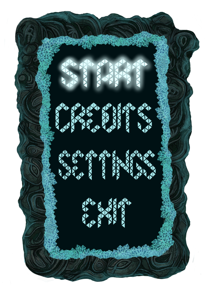
However I still focused on the idea that it should fit the art style of the game. I thought of making some kind of foreshadowing for the actual in-game directly on the menu, so I used the walls and the crystals in front of them to create a frame for the different buttons (start, exit etc.). By showing something in game before actually being in game is a way to invite the player to go in.

Then I needed to choose an appropriate font for it so I went for a triangular font to remind of the crystals in the game. In case you ever want to use the same font (it’s a free one), it’s called Merkur. I also used the same colors. I also designed it so that when the mouse hovers one of the buttons there is a glow around it.

I made a dark background so the font pops out nicely and as I wanted make it easily readable.

Here is it:UI menu
 

And here it is when it is actually implemented in the background:

menu in context UI

As you can see it looks consistent and in harmony with the background. So my expectations were met. I am overall satisfied with this design.

Thank you for reading! Hope you enjoyed.


Shot, shot, shots.

Heyo, here we are again for a new post on my blog. Today I’m going to talk projectiles and their animations. So buckle up your seat belt and let’s jump in into panda’s analytical brain again.

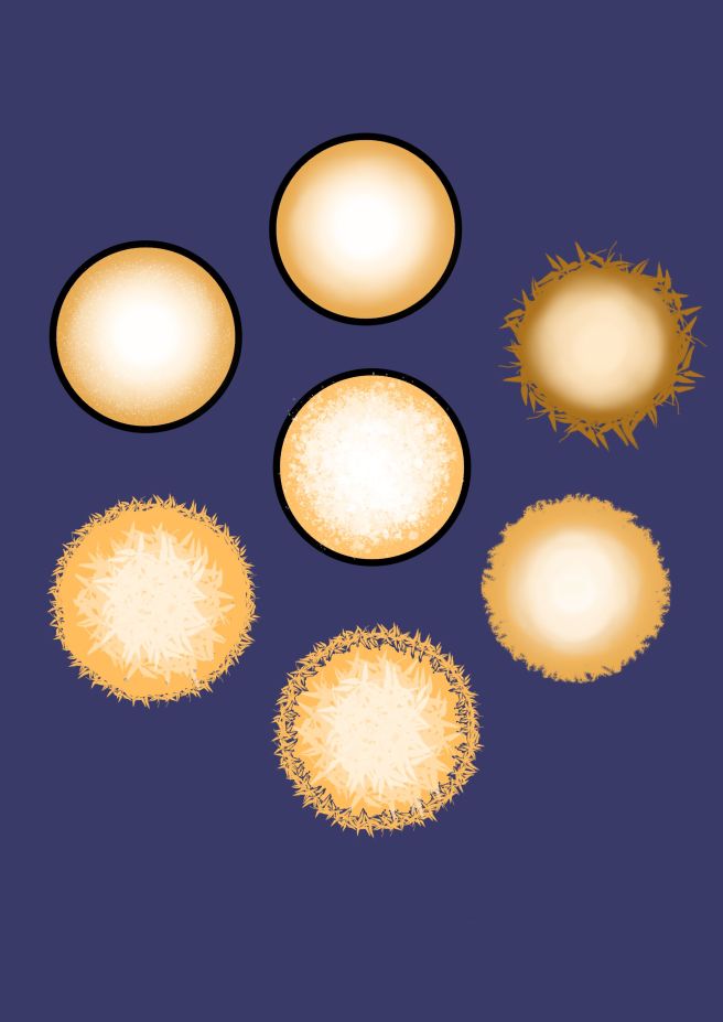
Anyway for today I’m going to talk about projectiles. At first I thought since our protagonists are insects, that they would spit fluids at their enemies and that their fluids would be on the other side of the spectrum to bring contrast. Per example if an enemy is blue the contrast of value for that one would be orange etc. Here are my tries for fluids:

xd

However in our game, it’s the crystals that gives energy so we thought of making the projectiles some kind of energy ball. And since crystals are blue it would be logical to make them blue as well.

Energy beams are different from fluids, they have to look less organic and more electric and crisp. They however can be simplified into a simple ball as well, but I  realized after some tries that I wanted something more than that. Here are some I made :

shots

As you can see they all look kinda alike, I fiddled with the different brush proposed to me in Krita and came up with this result. Some definitely look charged up with energy while some look unidentifiable.

As a base I chose bottom  right because I found the pattern around it interesting. I went on with this but as I wanted it more complex I added something in the middle of that energy ball. Here is how it looks in it’s final form:

bullet-projectile

Last step was to animate it to make it move a bit, makes sense as it is an energy ball. I wanted to make the middle figure have a definite pattern so it looks like it’s moving like a fluid.

However the brush I used was fairly unpredictable, so I had to adapt and change my vision. I simply decided to draw a different pattern in each frame so it looks like it’s moving too fast for the eye.

Anyway see by yourself and thank you for reading! See you next time.

gifprojectile

Background: The Light Night

Hello, today I’m going to talk about my aesthetic choices when making a background for our game. The environment in our game is depicted as made of stone with some rare trees here and there.

For the atmosphere of the background I inspired myself from the background that is inside the tree right here:

loopable-2

The background I made will be seen because there will be ”cracks/holes” in this inside background. As you can see the mood here is dark but also has that faint glow that comes from the crystals, bringing a bit of light to it.

To fit this mood I imagined showing some other trees with a pretty environment. I decided to put the background in ”night mode” so it fits this inside.

However my first mistake was made at that moment, because I imagined a forest, but our designer corrected me on that, mentioning that it wouldn’t make for the character to choose one tree in particular which she seems to do in our game. I decided then to make the trees more rare on the picture. And I also drew too much cracks on the tree, which made it look weird, like glowing worms moving on the tree.

A good thing that came of it was the idea to add alien looking mushroom on the ground, so the universe seems a bit more organic.

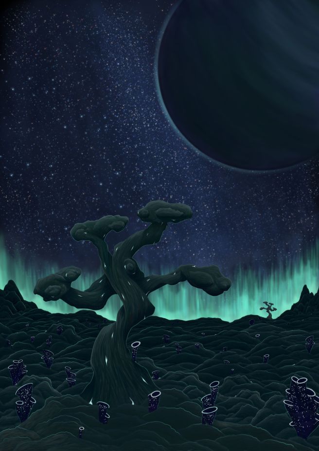
Here was my result (obviously not finished) :

rtyuio

With the trees being scarce, I decided to remove the mountains, they would have looked imposing and making all the details for it would have been just tiring. Besides I thought there would be more interesting things to do if I had a bigger piece of sky to work with.

The designer had the same idea as me which was to put some aurora in the sky. It adds the glowing effect I needed to fit the desired mood and make the composition more harmonious.

In the end I also added a planet in the top right corner because the sky felt a bit too empty. I realized how filters can be useful and time saving, I realized I could simply modify the colors and contrast whenever I wanted, which helped me in the end when I was trying to figure out exactly how dark it should be in contrast with the lit parts. Anyway here is my result. Thank you for reading!

backround7

Enemy Animation

Hey this is me again. This post is a continuation of my enemy design post. In this one I’ll talk about my process of animating my design.

My enemy is an insect, so obviously I needed to do some research to understand how six legged creatures works. During my search I didn’t find much material about it but an article describing how it should look like caught my attention. It stated than the all the legs on one side move almost at the same time forward and then the others follow etc. I realized a first animation following that statment.

It ended up looking bad and unnatural. Sadly I can’t show you my first try because I simply erased it and started one anew. I obviously needed to do more research and ended up finding this video:

This really helped me. I deconstructed the movement of the insect. And what I’ve realized is that an ant is moving tree legs forward (two on one side and one on the other one) while the others serves to keep the body steady.

Next step was to apply it to my bug.

I deconstructed all my body parts and kept them on separate layers so I can move them one by one. Moving all the legs in every frame at the same time sounded difficult, so I separated the movements of the legs in two parts. Firstly I animated the three legs going forward and back. Secondly, after that was done I did the other set of legs. Finally I realized the pincers and sensors were still static so I made them move slightly from left to right to make the insect look more vivid.

This animation ended up looking way better than the first one. I am somehow satisfied with the result, the movements of the bug definitely look more natural. However because I was animating with Krita and probably because this is the second animation I made in my entire life the movements were not as fluid as I would have wanted them to be. So what I need now is practice, practice and even more practice. (And this is an advice to however is reading this: Never underestimate the benefits of a thorough research when you want to do something you have no clue about or even if you have some).

bug-walk-fast


Enemy Design

bug

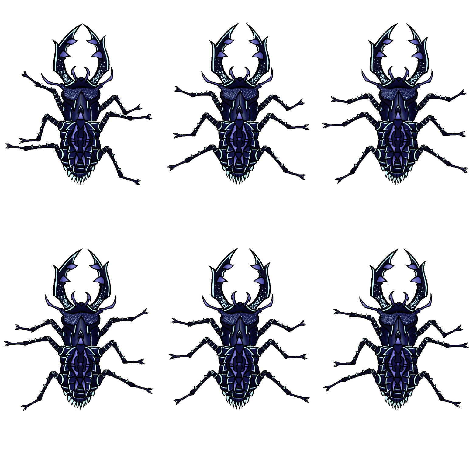
This one enemy I made for our game ‘Crown of Creation’.

This is a melee enemy that can attack the protagonist with its pincers. I made several researches on insects behaviors and looks before designing one. I based this character on a horned beetle because this type of insect looks more bulky and strong. It corresponds to a melee character. Firstly, I thought of making it have two horns on top of each other on its head like I designed it on this character concept sketch:

bugg

However, after some reflection I thought this wouldn’t look so good from a top down perspective. It would be hard to differenciate the top horn from the down horn. Especially during the attack animation, where the bug snaps at the player.

This enemy as our other ones is blue. A colour associated to a calm  feeling and stability. The player plays as a red spider queen, to show that she is the invader among those other protagonists. Red symbolizing danger and power. After the destruction of her home, she is in research for a new place, simply invading someone else’s.

That’s for the colours and the shape of this enemy. As you can see there are very high contrast on this bug skin. The bright blue parts are there to signify that the enemies take their energy from crystals present in their environment. That is why some part of the bug looks like they’re glowing. This will also help the player spot them easily.

On my final version of this enemy I removed its eyes to make it look more like a simple enemy, contrary to the boss who has some.

There are a lot of different elements parts and details on this bug. I also made them sharp to signify to the player that there is danger. This was to follow the style of the artist that made our main character. That looks like this:

spider_doll_spritesheet

I am overall  satisfied with my character design. It fits the general art style of the game and all the ideas are communicated well. I also separated all the bugs parts for the next step which is going to be animation. Thank you for your attention.